Ciné
Making movies easy
For my user research, I conducted 5 interviews in total. The initial assumption I had was that most moviegoers would love to use a ticketing app without hesitation. But I’ve discovered that they require more than just a simple app. Features such as seating maps and a history section for the past movie tickets bought were not something I expected.
1. Features
Users want more relevant features in their app, such as seating maps, history and ticket sharing.
2. Fluidity
Users want to be able to understand their app, use it the right way without getting lost.
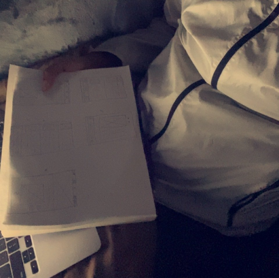
Lo-Fi Prototype
Click To ViewDigital Wireframes
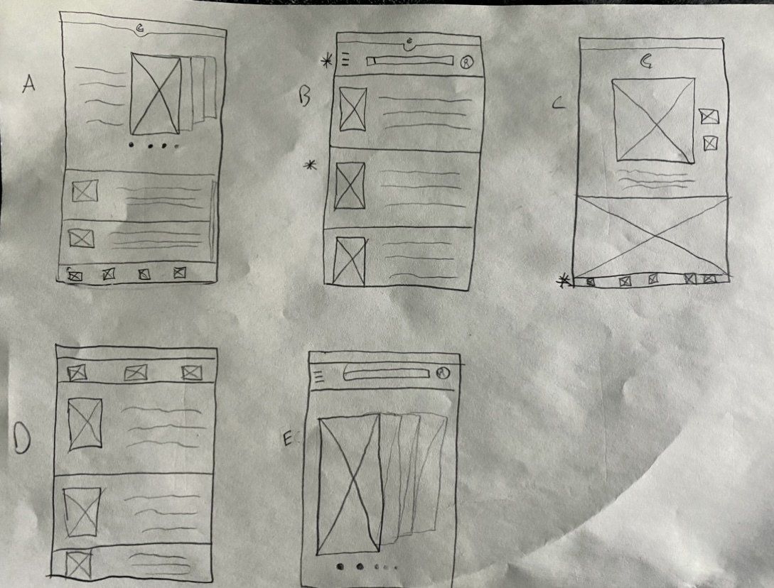
I wanted to include a header, a fluid layout and a navigation bar at the bottom. I also wanted to give users a way of playing trailers and bookmark movies for a different time.
Low-Fidelity Prototype
For my user flow, Users start on the homepage and pick a movie. Then they pick seats and proceed to checkout. They get a “Almost there” page where they confirm the purchase before getting a Confirmation page. Then finally, they reach the Tickets page.
Click on the image to check out the lo-fi prototype.
Moderated Usability Studies
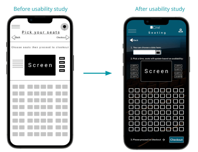
I conducted two usability studies and discovered some helpful insights:
- Users tap on words rather than icons.
- Users want all their features under the same menu.
- Users want simpler way to find tickets.
- Users want more than 1 way to get to the home page.
- The confirmation screen has too much text.
- Drag left to open navigation menu not as useful.
New Paragraph
Slide title
Write your caption hereButton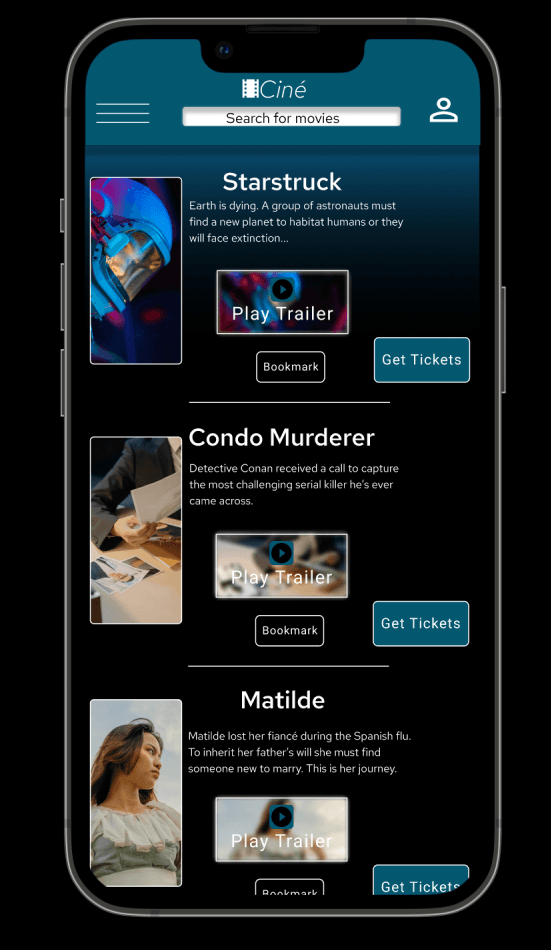
Slide title
Write your caption hereButton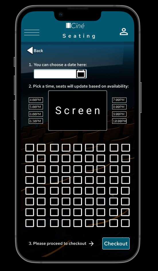
Slide title
Write your caption hereButton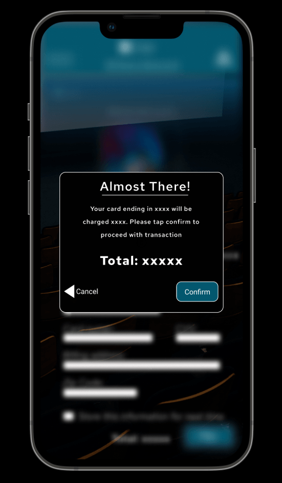
Slide title
Write your caption hereButton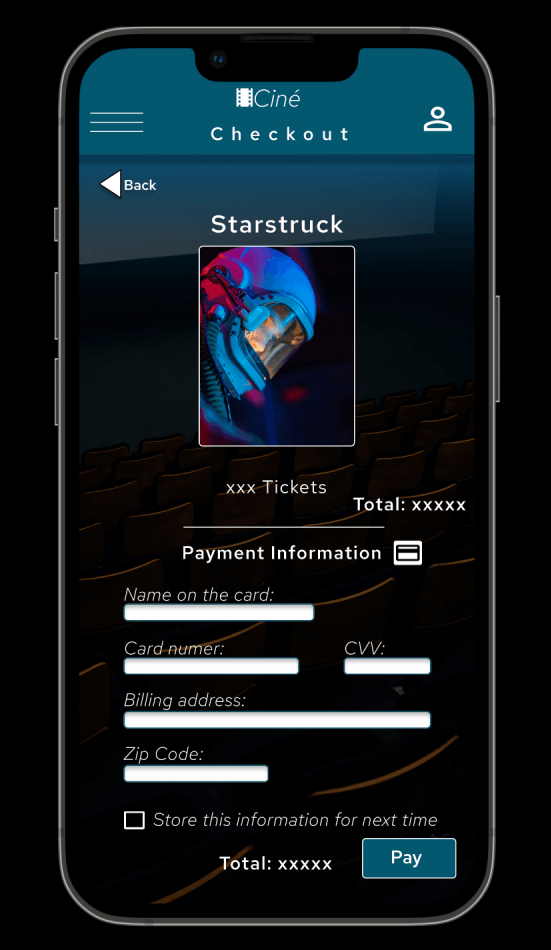
Slide title
Write your caption hereButton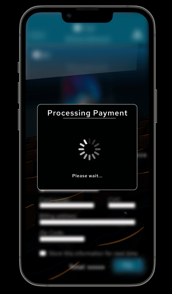
Slide title
Write your caption hereButton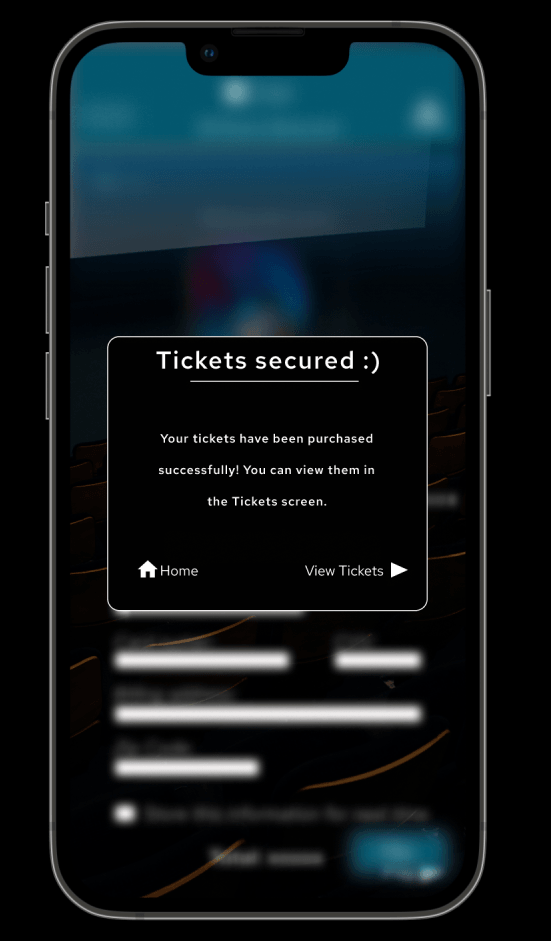
Slide title
Write your caption hereButton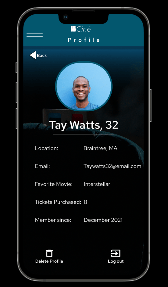
Slide title
Write your caption hereButton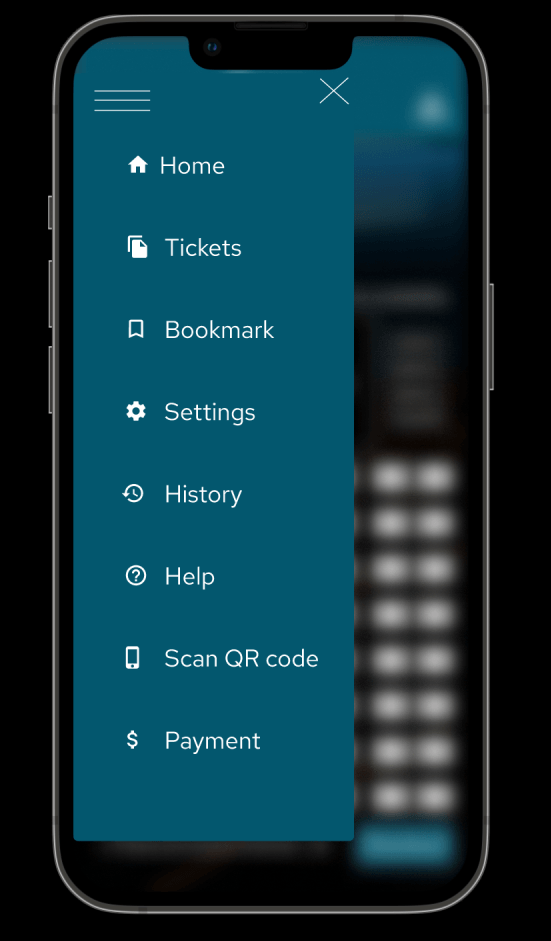
Slide title
Write your caption hereButton
High-Fidelity Prototype
The final prototype includes a startup screen and a profile screen. You can easily follow the user flow and never feel stuck or forced to complete an action. Check it out clicking on the image. (click on restart at the bottom right to view startup screen)
Accessibility Considerations
- This teal accent color is accessible with a white text. I picked it for buttons and for the navigation menu.
- I used relatable Icons to help users get familiar with the navigation menu.
- The animations and transitions between pages are in between 200-300ms
Takeaways
- Ciné is an easy to use app to purchase tickets before heading to the movie theater. Users can feel at ease knowing they won't have to stand in line, or use kiosks so they can keep themselves safe.
- Designing is not easy, you have to keep so many things in mind and remember you’re not just designing for one specific group, it should be for everyone. Accessibility is very important and helps your app flourish.
Thank you for checking out Ciné, I had a lot of fun with it as my very first design!
Take a look at my other projects

